50 years ago: Countdown to UCSC’s 50th anniversary
Editor’s note: This second installment in our series of stories leading up to a celebration of UCSC’s 50th anniversary looks at the early architectural plans that were taking shape 50 years ago, in preparation for UCSC’s opening in 1965. This is a longer version of a story that appeared in the spring ‘13 issue of Review magazine.
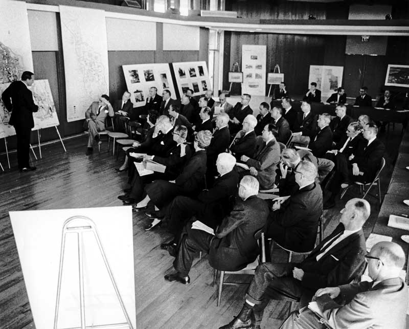
 The Regents Committee onGrounds and Buildings meton January 17, 1963, at First Congregational Church onHigh Street, where they approved the campus’s original Long Range Development Plan. Dean McHenry, UCSC’s founding chancellor, is at the very bottom right. (Photo by Vester Dick)
It’s hard to imagine what UC Santa Cruz might have become: a cluster of high-density buildings rising out of the Great Meadow like some unsightly crown.
But thanks to a combination of two visionary UC administrators, a modernist landscape architect, and an influential team of California architects, those early plans to build a university in the middle of beautiful slope of grass died a quick death. Instead, the state’s seventh UC campus became a daring experiment, not only in its academic form but also in its design.
It was UC President Clark Kerr and UCSC’s first chancellor, Dean McHenry, who championed a bold educational plan for the campus, which was to be set on 2,000 acres of ranch land overlooking the Monterey Bay.
Instead of a large, impersonal university, McHenry and Kerr—old college roommates — envisioned 15-20 small residential colleges with individual identities where students would mingle closely with their professors while enjoying the benefits of a major research institution.
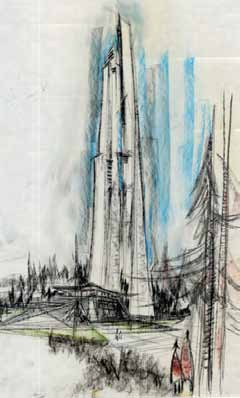
 An artist’s rendering of the proposed tower near Science Hill included in UCSC’s early architectural plans. (Image courtesy of UCSC Physical Planning and Construction)
The New York Times called it “an experimental project widely regarded as one of the most exciting in education.” The two men insisted the campus architecture reflect those same innovative ideals.
“California was full of the post-war optimism of the 1950s,” said Frank Zwart (Cowell ‘71), UCSC’s Campus Architect Emeritus. “Everything was possible and California was the wave of the future.”
In that spirit, Kerr and McHenry wanted buildings that were original, matched the spectacular landscape, and not only fostered community but also intellectual exploration.
In his oral history, Kerr likened his idea for the campus design to an old fishing village, Aigues-Mortes, in southern France where one step through an ancient stone wall took a visitor from a bustling town into the forest. McHenry talked of finding “as much diversity among the colleges as you’d find in a high quality residential district of a suburban area of city.”
They convinced Regents to hire a consortium of influential Northern California designers to prepare a master plan that would concretize their maverick vision and guide the location and design of buildings. Architects John Carl Warnecke, Ernest J. Kump, Theodore Bernardi, Robert Anshen and Steve Allen were soon wandering the old Cowell ranch land, taking notes and envisioning what a new university could be.
Leading their walks through the grass and redwoods was Thomas Church, a UC Berkeley- and Harvard-trained landscape architect known for his trademark hat, high-laced boots, and the way his designs blurred the border between inside and out.
Church and the architects were so struck by the beauty of the UCSC site they convinced the Regents to move the heart of the campus out of the meadow and into the trees, where the flora and terrain would be both a challenge and an inspiration.
“Instead of remaking the land, the land must remake our standard conceptions of building and place and parking lot,” Church wrote enthusiastically after touring the site in 1962. He warned, however, “any attempt of a designer to compete in grandeur with this site is doomed to failure…color and texture will be as important as form.”
Rather than being daunted, the master planners rose to the land’s challenge of knolls, ravines and towering trees. “Never, perhaps, has the site chosen for the development of such a venture been so inspiring,” the architects wrote in their 1963 Long Range Development Plan (LRDP).
They noted, it was also a time when architectural styles were being reappraised, affording a chance to be different. “There is a new desire for emotional content in the design of important buildings, and for a richness and subtlety that seems to have been lost in a concern with technological innovations,” they wrote
The planners envisioned one type of architecture for buildings that would sit “proudly” on hilltops and another for those sheltered in the trees. Colleges would be no more than three-stories with the potential for high-rise structures as the campus grew. They talked of using light colors and off-whites used in densely forested areas with warmer earth tones on sunny hilltops. Textures would range from smooth to rugged and while the residential colleges would be informal in style, the central campus buildings would be more formal, “almost monumental.” There must be no clichés, no tired architecture—whether traditional or modern, they said.
They wrote of a science center that would give “a sense of courts and quadrangles with provisions for future tower buildings.” They envisioned undergraduate colleges within walking distance of the academic core and other colleges. “Thus there is separation but no sense of isolation,” they said.
Most importantly, they wrote, “The campus should not have a single ‘style.’”
Three of the LRDP architects went on to design buildings on campus. John Carl Warnecke and Associates created McHenry Library with its textures of concrete, exposed aggregate and glass reflecting the ruggedness of the forest. Kump Associates of Palo Alto designed Crown College, and Theodore Bernardi of Wuster, Bernardi and Emmons planned the campus' first college, Cowell.
It was not an easy road, however.
Bernardi, whose firm was closely associated with what was known as Bay Area Style which lay between the more severe International and elaborate Beaux Arts styles, produced a design for Cowell that was first rejected both by Kerr and the Regents.
“…It looked like a motel on Lake Tahoe — scattered throughout the trees,” Kerr said in his oral history. The firm was sent back to design a cluster of inward-facing buildings with cast-in place concrete walls, heavy timbers and red-tile roofs nestled on the very edge of the forest. Two courtyards “one for men, the other for women,” were included in the plan, according to McHenry in a 1963 Chancellor’s memo.
Joseph Esherick’s Stevenson College with its shed roofs and saddlebag-style rooms reflected his dedication to site requirements and user needs. Campus architect Zwart noted Esherick went so far as to lay out buildings on the site as design work progressed, skewing some of the building footprints in order to preserve a number of massive redwoods.
Budget constraints, however, forced the use of cheaper materials like stucco, wood frame and nail-on windows rather than the concrete and timber used for Cowell.
Both Cowell and Stevenson colleges were completed in 1966 — a year after the UCSC opening, forcing students to live in trailers, eat their meals in the East Field House and take classes in what is now Thimann Laboratories for the first year of their college life.
Crown and Merrill came next in 1967 and 1968-69.
Merrill College architects Campbell & Wong set their stark buildings amid thick redwoods with playful components like bridges, balconies and blue roofs. Crown’s architect, Ernest J. Kump, would follow a slightly more traditional path that barely hinted at his innovations in the world of modernism during the 1930s and 40s.
All four of the early colleges seemed to satisfy the ideals set out by the founding architects — although neglected from the Long Range Development Plan design was an intramural sports stadium proposed for the quarry and a giant tower rising out of the redwoods near Science Hill — a feature that may have been better left unbuilt, according to Zwart, who saw sketches of possible designs for the edifice.
“It had a real Jetsons quality to it,” Zwart said.


